// Em 2024 este projeto foi selecionado para entrar na lista de Melhores Logos de Igrejas pela DesignRush, uma plataforma conhecida por promover os melhores projetos de design!
// In 2024 this project was selected to be featured in the Best Church Logos by DesignRush, a platform known for promoting the best designs!
// PT-BR
Pessoas de diferentes idades, diferentes contextos de vida, diferentes raças, classes sociais, gostos, estilos e pensamentos, mas ainda pessoas que se veem ligadas pela fé e o senso de comunhão entre si. Assim é a Igreja Presbiteriana Nova Vida, uma comunidade pequena e simples, feita de pessoas imperfeitas e reais, que enxerga na pluralidade e diversidade humana a expressão da imagem de Deus, e que encontra no relacionamento e na conexão real a base para viver o cristianismo.
Após se fundir à Igreja Presbiteriana Boas Novas, a IP Nova Vida entendeu que era momento de comunicar melhor seus valores e propósito à cidade onde está inserida, e uma das etapas foi a construção de uma nova marca.
Após se fundir à Igreja Presbiteriana Boas Novas, a IP Nova Vida entendeu que era momento de comunicar melhor seus valores e propósito à cidade onde está inserida, e uma das etapas foi a construção de uma nova marca.
Neste trabalho vocês podem conferir um pouco do desenvolvimento e descoberta da nova marca da Igreja Presbiteriana Nova Vida.
// EN
People of different ages, different life contexts, different races, social classes, tastes, styles, and thoughts, yet people who see themselves connected by faith and a sense of fellowship with one another. That's what the Igreja Presbiteriana Nova Vida (New Life Presbyterian Church) is like, a small and simple community made up of imperfect and real people, who see in human plurality and diversity the expression of God's image and find in genuine relationships and connections the foundation for living out Christianity.
After merging with the Igreja Presbiteriana Boas Novas (Good News Presbyterian Church), IP Nova Vida realized that it was time to better communicate its values and purpose to the city where it is located, and one of the steps was the creation of a new brand.
In this work, you can see a glimpse of the development and discovery of the new brand of Igreja Presbiteriana Nova Vida.
// PT-BR
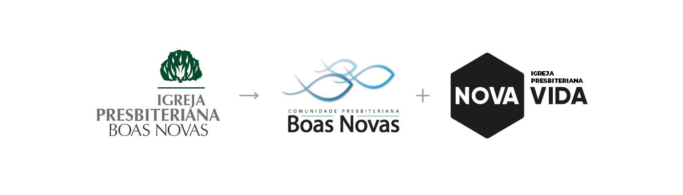
Antes da fusão das duas igrejas, cada uma delas apresentava diferentes marcas - e nenhuma delas tinha capacidade de comunicar suas essências. Por um tempo a IP Boas Novas utilizou a já datada e carregada de tradicionalismo marca da Igreja Presbiteriana do Brasil, migrando depois para uma marca própria bastante problemática do ponto de vista técnico. Já a IP Nova Vida adotou como marca em seu início um símbolo hexagonal e tipografia em preto e branco, o que a diferenciava de outras igrejas da cidade, porém se apresentava genérica e vazia de significado.
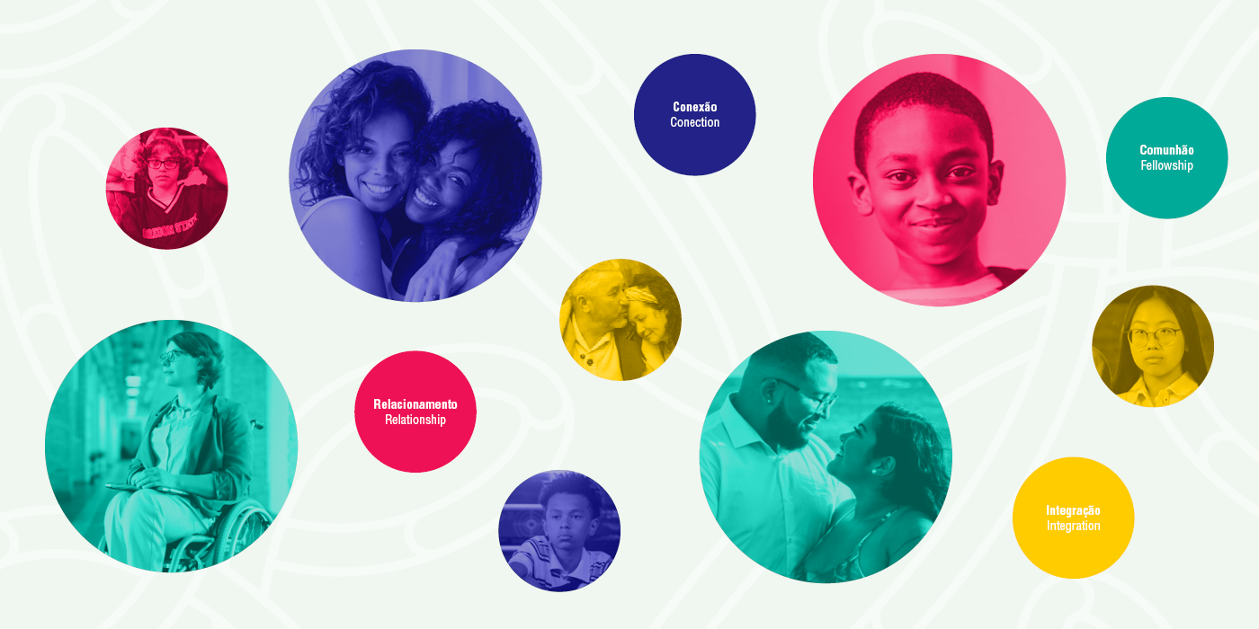
No momento da fusão, deixamos de lado as marcas antigas e buscamos entender o que havia na essência de cada uma delas que fosse possível traduzir em palavras e elementos visuais. Conversando com membros, líderes e com a comunidade ao redor dessa nova igreja, percebemos que regras, tradicionalismo e formalidades passavam longe dessa instituição. Tampouco importava para eles o número de membros ou como estava a arrecadação financeira. O foco dessa igreja estava no relacionamento, na integração e na comunhão.
No momento da fusão, deixamos de lado as marcas antigas e buscamos entender o que havia na essência de cada uma delas que fosse possível traduzir em palavras e elementos visuais. Conversando com membros, líderes e com a comunidade ao redor dessa nova igreja, percebemos que regras, tradicionalismo e formalidades passavam longe dessa instituição. Tampouco importava para eles o número de membros ou como estava a arrecadação financeira. O foco dessa igreja estava no relacionamento, na integração e na comunhão.
Em uma palavra, essa igreja tem como foco a Conexão:
- Conexão com Deus através do evangelho e da esperança da eternidade;
- Conexão entre pessoas através do discipulado, do cuidado mútuo e da ideia de que essa é uma igreja para todo tipo de pessoa;
- Conexão com a cidade, buscando ser relevante, transformadora e abençoadora para a sociedade;
Partindo dessas descobertas, optamos por utilizar na construção dessa marca o arquétipo do Cara Comum, reforçando a ideia de que não importa se você é um pastor ou leigo, membro ou visitante, criança ou idoso, rico ou pobre, homem ou mulher: essa igreja é uma comunidade para todos que querem, juntos, viver uma nova vida.
// EN
Before the merger of the two churches, each of them had different brands, and none of them had the ability to communicate their essences effectively. For a while, IP Boas Novas used the outdated and traditionalist brand of the Igreja Presbiteriana do Brasil (Presbyterian Church of Brazil), later transitioning to its own brand, which was problematic from a technical standpoint. On the other hand, IP Nova Vida initially adopted a hexagonal symbol and black-and-white typography as its brand, which set it apart from other churches in the city but lacked meaning and originality.
At the time of the merger, we set aside the old brands and sought to understand what essence each church had that could be translated into words and visual elements. Through conversations with members, leaders, and the surrounding community, we realized that rules, traditionalism, and formalities were far from the essence of this institution. The number of members or the state of financial contributions was also of little importance to them. The focus of this church was on relationships, integration, and fellowship.
In one word, this church focuses on Connection:
• Connection with God through the gospel and the hope of eternity;
• Connection among people through discipleship, mutual care, and the idea that this is a church for all kinds of people;
• Connection with the city, seeking to be relevant, a blessing, and eternally transformative for society;
• Connection with God through the gospel and the hope of eternity;
• Connection among people through discipleship, mutual care, and the idea that this is a church for all kinds of people;
• Connection with the city, seeking to be relevant, a blessing, and eternally transformative for society;
Based on these discoveries, we chose to use the "Everyman" archetype in constructing this brand, reinforcing the idea that it doesn't matter if you are a pastor or a layperson, a member or a visitor, a child or an elder, rich or poor, man or woman: this church is a community for all who want to live a new life together.
// PT-BR
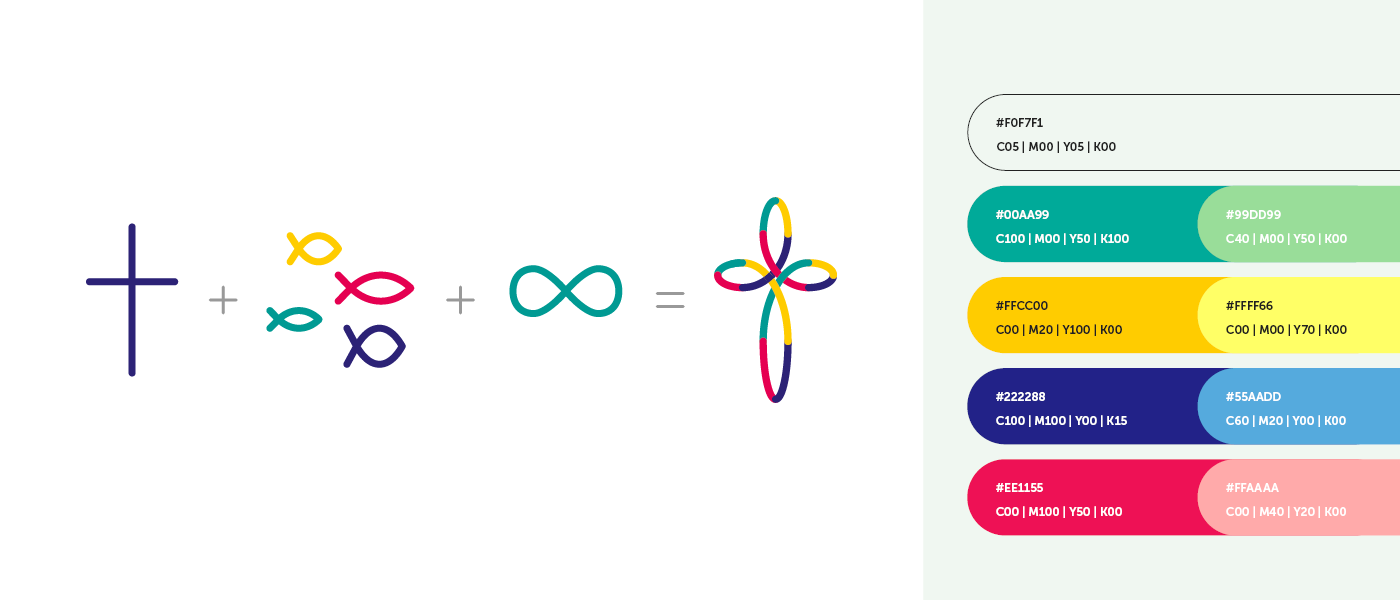
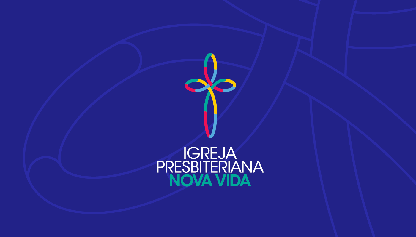
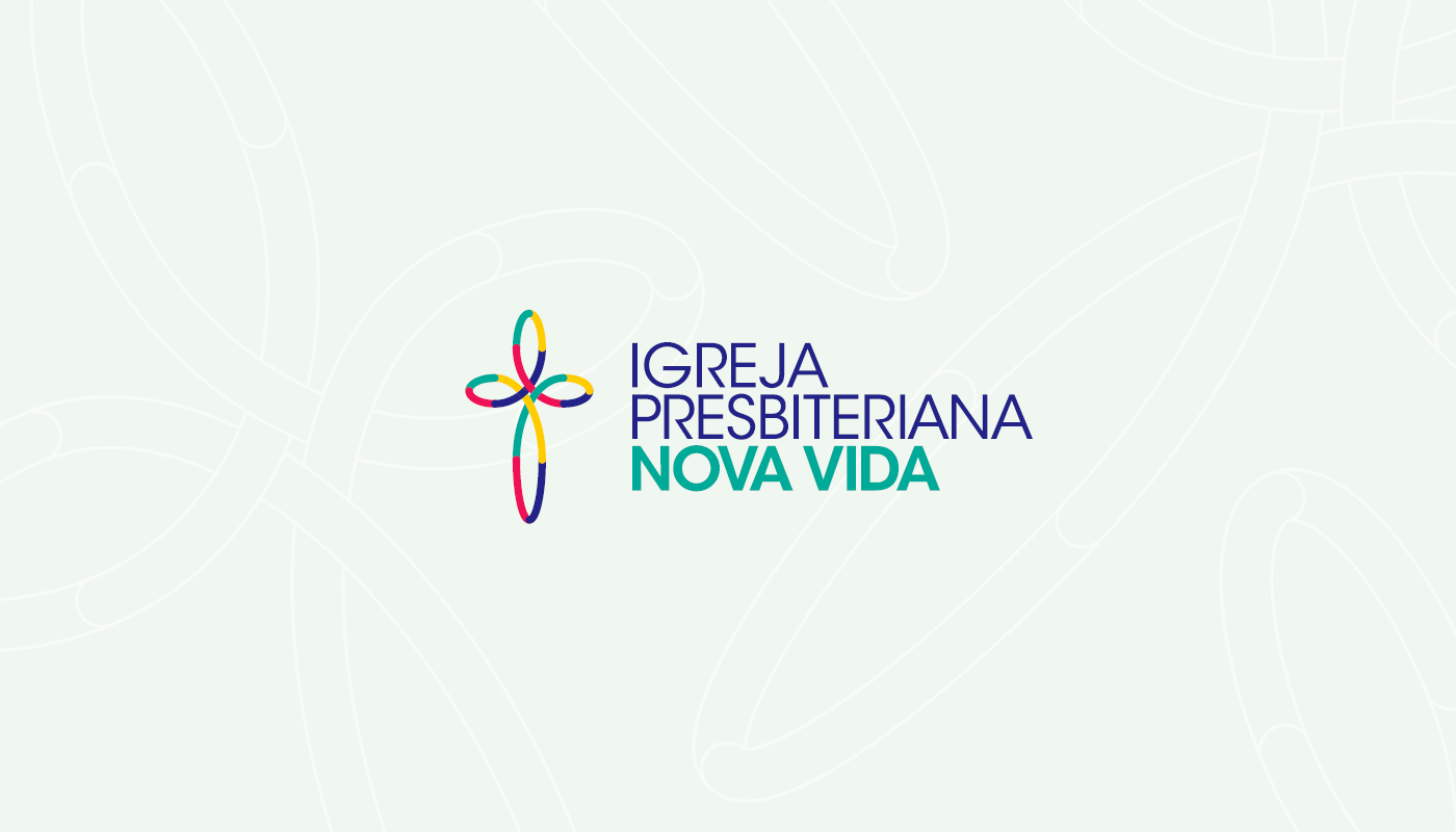
Partindo das definições de arquétipo, palavras chave e personalidade, seguimos para traduzir essas verdades em formas e cores. Entendemos que a criação de um símbolo simples e icônico deveria ter a capacidade de comunicar a essência dessa marca, então buscamos sintetizar a ideia das 3 conexões nele:
• A cruz, símbolo mais identitário na história do cristianismo, simboliza a conexão com Deus. Nela, Ele se fez sacrifício para se reconectar com a humanidade.
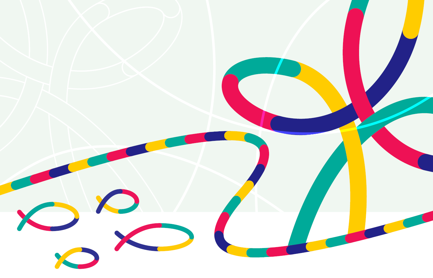
• Os peixes, símbolo muito usado pelos cristãos primitivos para se identificar, tomam cores e formas diferentes ao mesmo tempo em que se mesclam e se conectam entre si. Eles simbolizam a conexão entre as pessoas, cada uma diferente da outra, porém todas igualmente importantes e coesas quando conectadas.
• E, por último, o símbolo do infinito simboliza a conexão com a cidade, comunicando o propósito que essa igreja tem de transformar a realidade terrena vivendo uma vida com valores da eternidade.
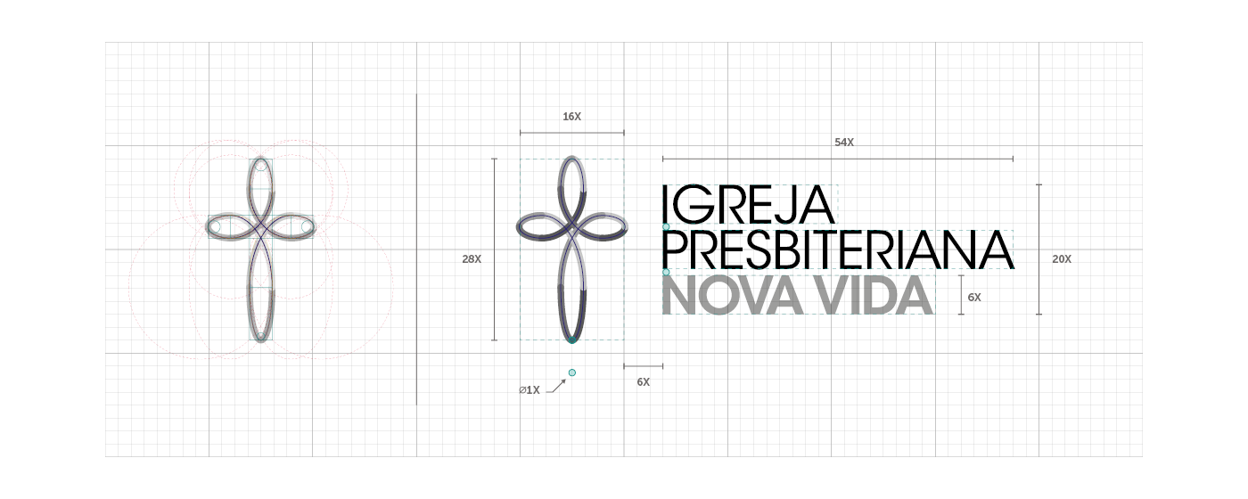
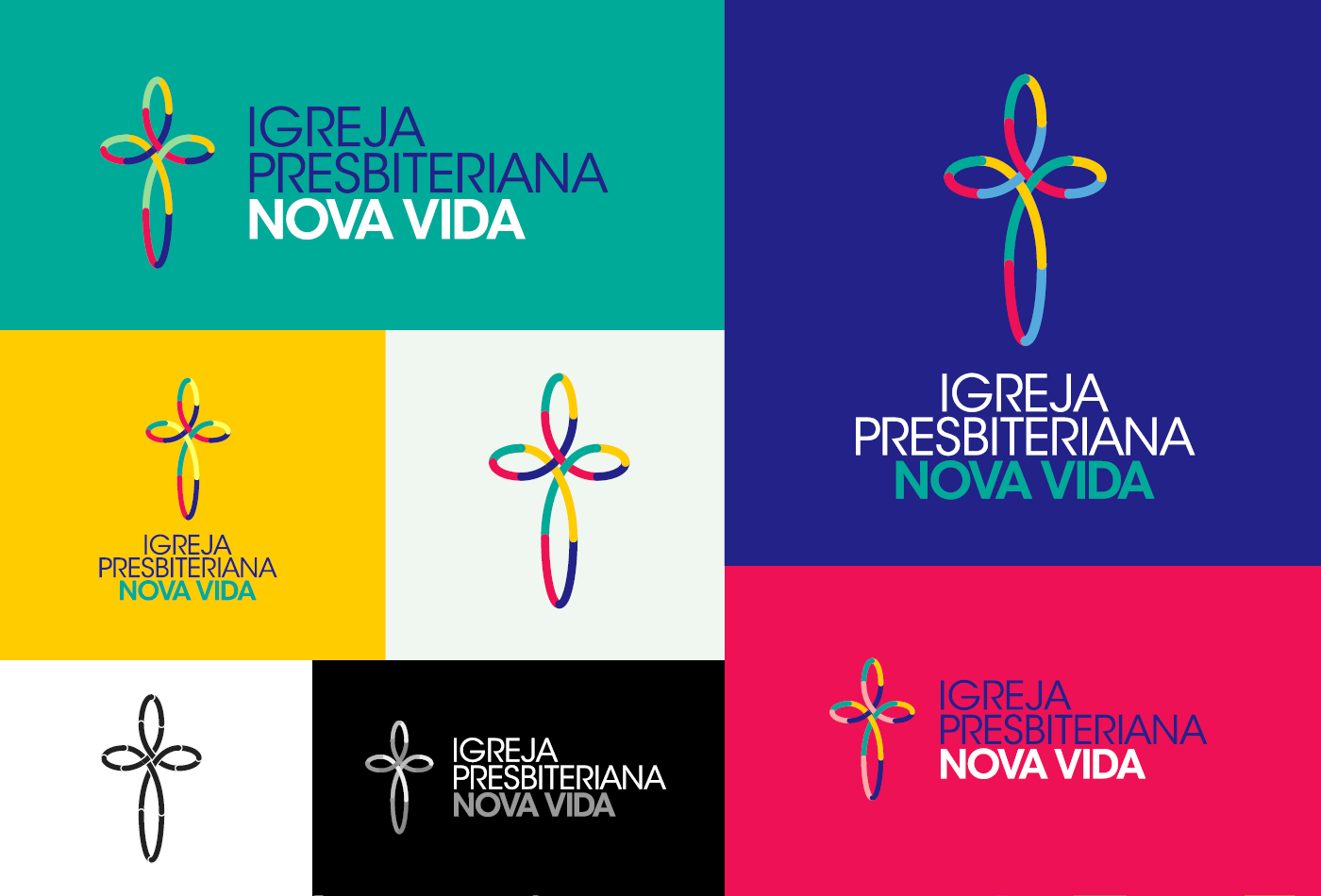
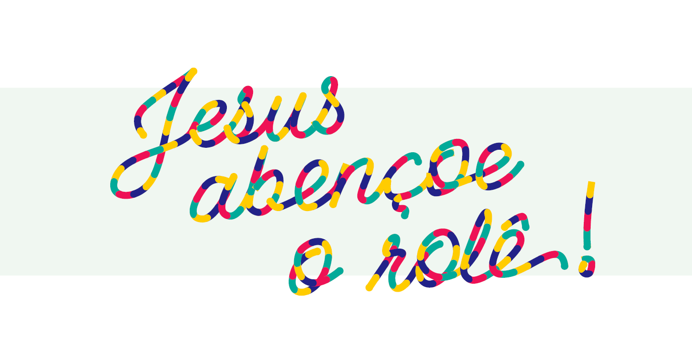
Aliada à uma tipografia simples e atemporal, a abundância de cores e formas busca transmitir um senso de comunidade e pertencimento cheio de alegria, diversidade e simplicidade.
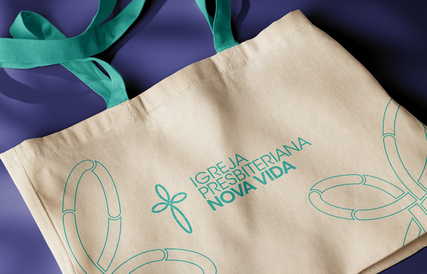
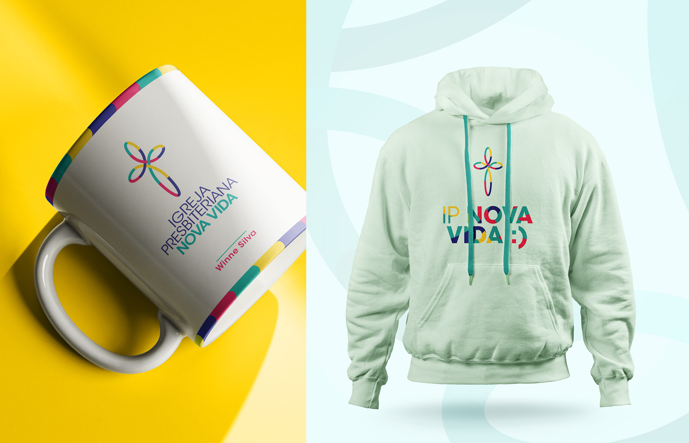
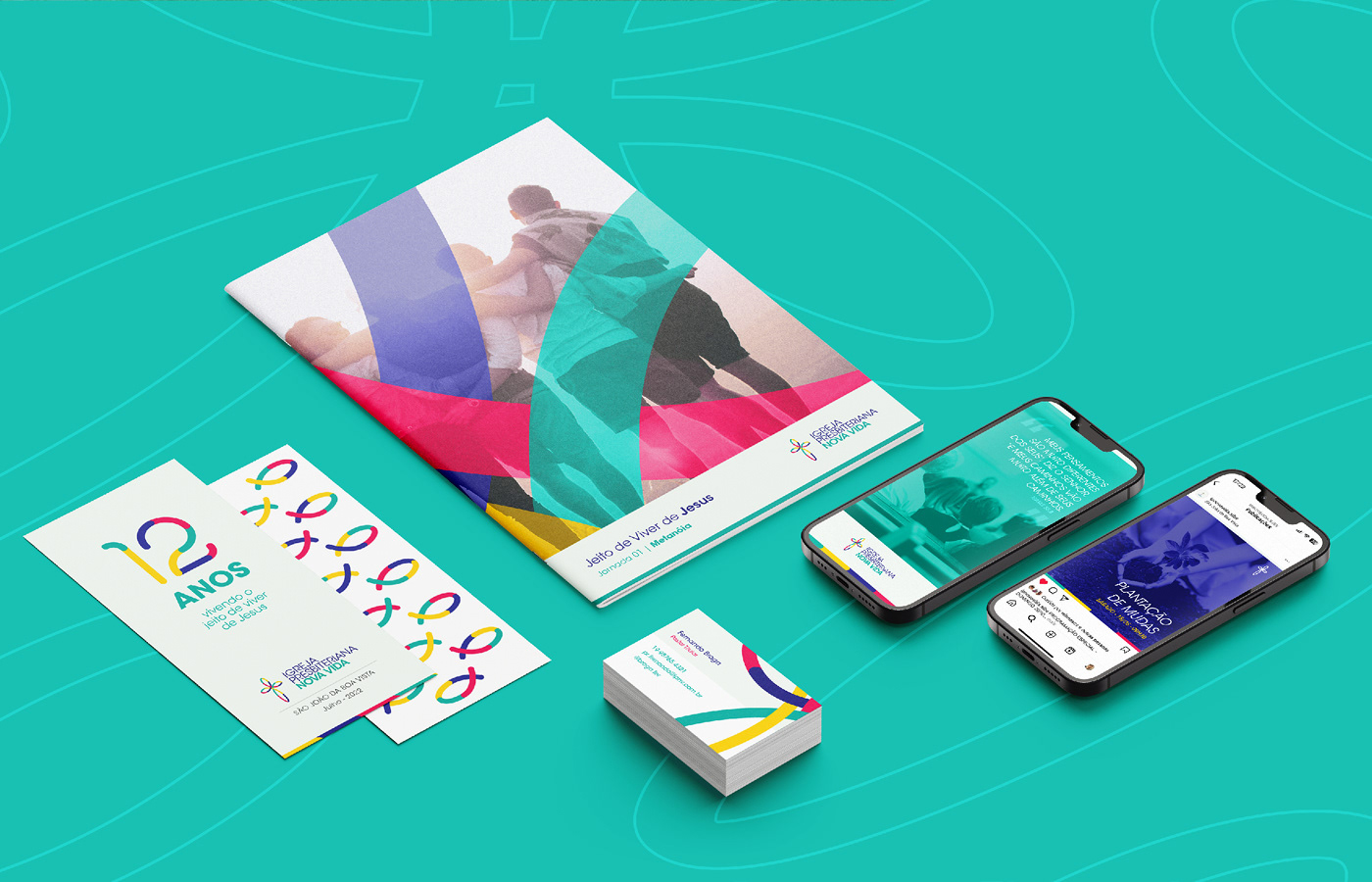
Confira a seguir um pouco do resultado de todo este processo.
// EN
Building upon the archetype definitions, key words, and personality, we proceeded to translate these truths into shapes and colors. We understood that creating a simple and iconic symbol should have the ability to communicate the essence of this brand. Therefore, we sought to synthesize the idea of the 3 connections within it:
• The cross, the most emblematic symbol in the history of Christianity, symbolizes the connection with God. In it, He became a sacrifice to reconnect with humanity.
• The fish, a symbol widely used by early Christians to identify themselves, take on different colors and shapes while merging and connecting with one another. They symbolize the connection among people, each one different from the other, yet all equally important and cohesive when connected.
• And finally, the infinity symbol represents the connection with the city, communicating the purpose that this church has to transform earthly reality by living a life with values from eternity.
Combined with a simple and timeless typography, the abundance of colors and shapes seeks to convey a sense of community and belonging filled with joy, diversity, and simplicity.
Take a look at some of the results of this entire process below.