
// PT-BR
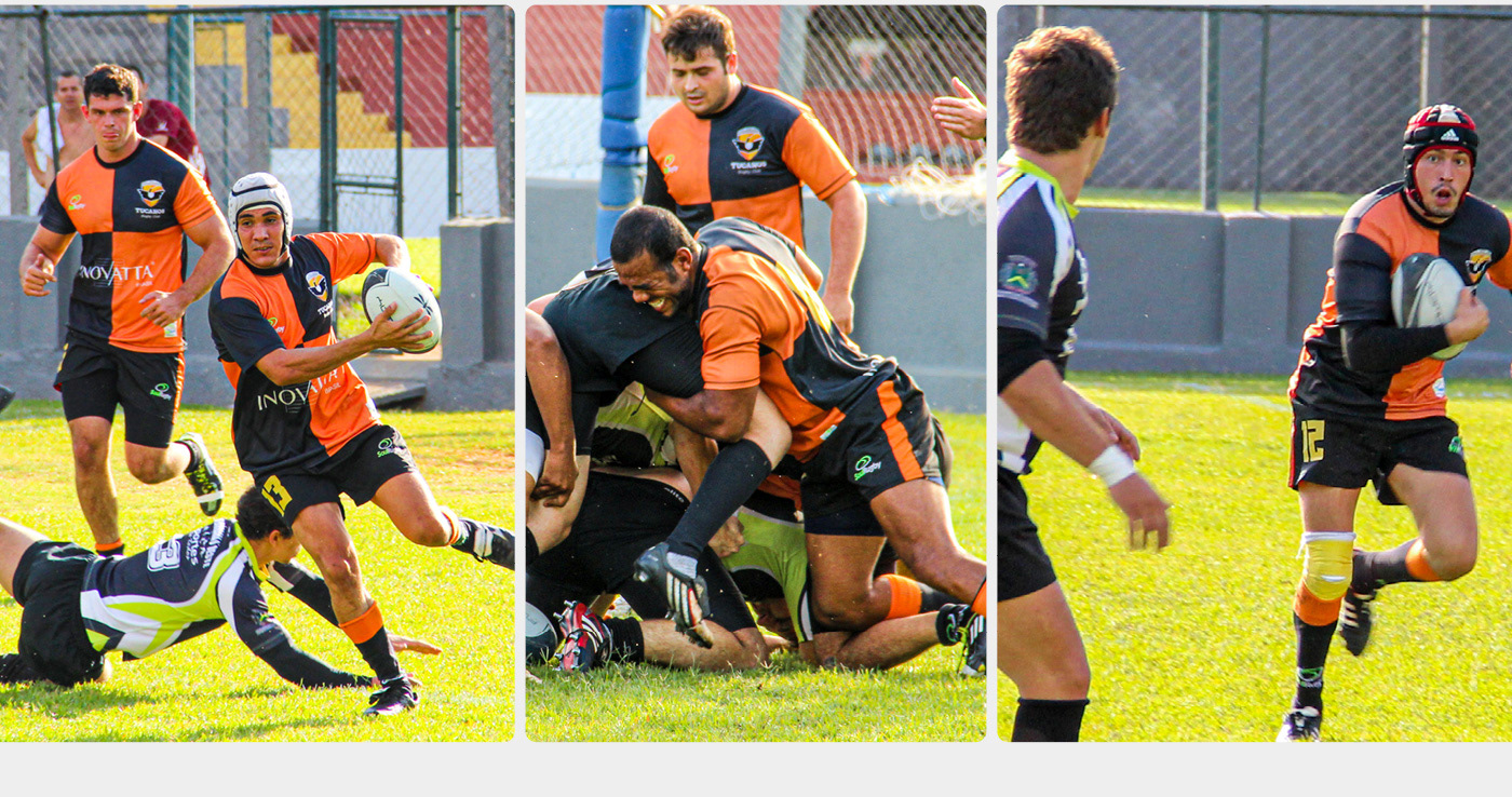
O Tucanos Rugby Club (@TucanosRugbyClub) é uma equipe de rugby que vem, ano após ano, se destacando no interior paulista. Fundada nas cidades de São João da Boa Vista e Águas da Prata (divisa de SP com o sul de MG), o Tucanos surgiu como um grupo de amigos que se reunia para praticar rugby, e se tornou uma equipe que sonha e voa cada vez mais alto: dos treinos noturnos em um campo cheio de buracos e iluminado por apenas 1 holofote, o Tucanos se profissionalizou, fez grandes parcerias, conquistou o vice-campeonato da Série B em 2019 e alcançou o acesso à Série A do Paulista.
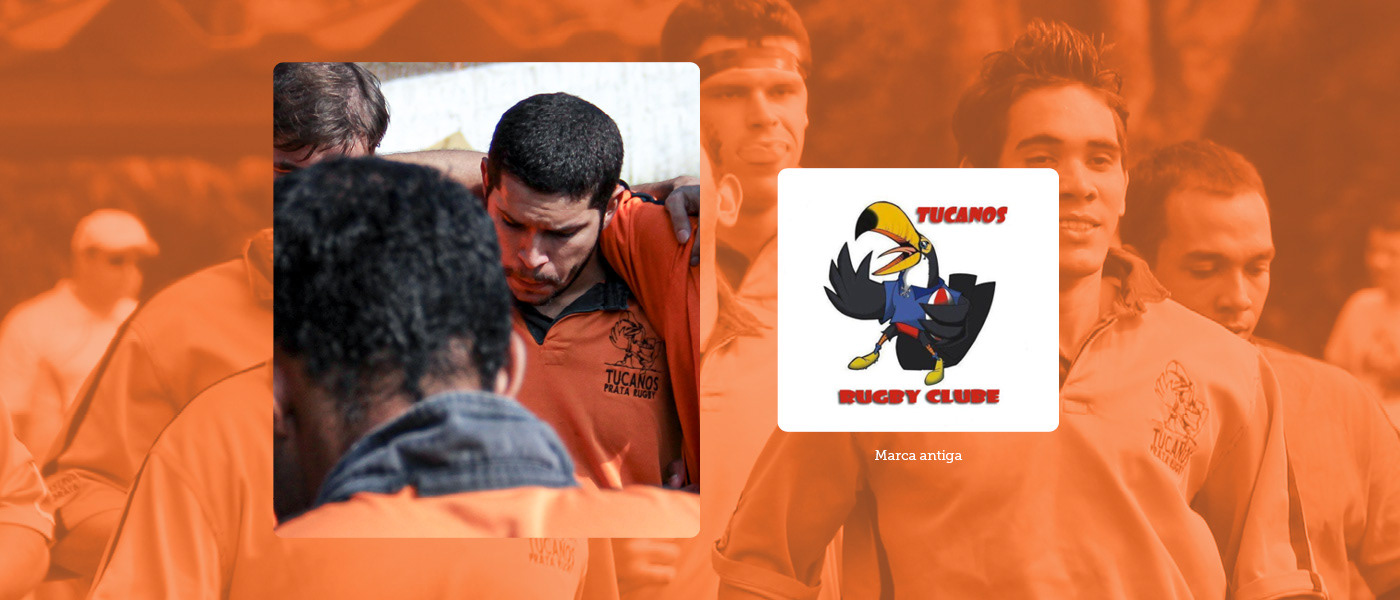
Durante esse processo de profissionalização, a equipe entendeu que sua marca (uma ilustração de um tucano rugbier) não era mais capaz de representar o time e suas aspirações. Era hora de adequar a marca aos sonhos de tornar o Tucanos um time do primeiro escalão nacional.
O trabalho que você confere a seguir mostra o processo de criação e descoberta de uma nova marca para o Tucanos Rugby Club.
// EN
Tucanos Rugby Club (@TucanosRugbyClub) is a rugby team that has been consistently standing out in the interior of São Paulo, Brazil, year after year. Founded in the cities of São João da Boa Vista and Águas da Prata (on the border between São Paulo and the southern region of Minas Gerais), Tucanos started as a group of friends gathering to play rugby and has evolved into a team that dreams and aims higher each day. From evening training sessions on a field full of holes, illuminated by just one spotlight, Tucanos has professionalized, formed great partnerships, achieved the runner-up position in Serie B in 2019, and gained promotion to the Serie A of the Paulista Championship.
During this process of professionalization, the team realized that its current brand (an illustration of a rugbier toucan) was no longer capable of representing the team and its aspirations. It was time to align the brand with the dreams of making Tucanos a top-tier national team. The following work showcases the process of creating and discovering a new brand for Tucanos Rugby Club.
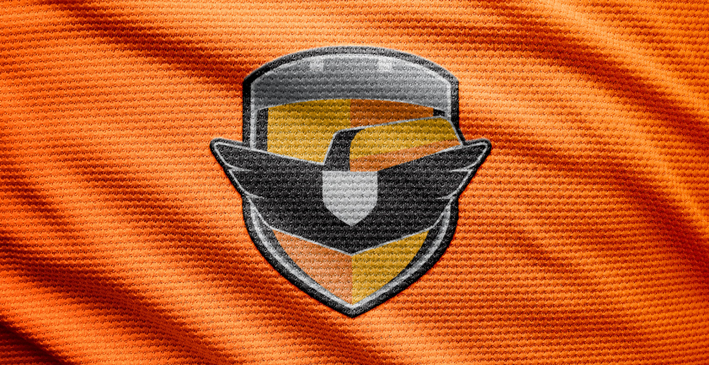
// PT-BR
No processo de criação e descoberta dessa nova marca, buscamos primeiramente definir um arquétipo de marca que traduzisse e orientasse toda a personalidade e as expressões verbais e visuais desejadas. Levando em conta toda a história de luta e superação do time, optamos pelo arquétipo do Herói, sempre em busca da vitória pelo esforço, dedicação e coragem ao enfrentar os maiores desafios.
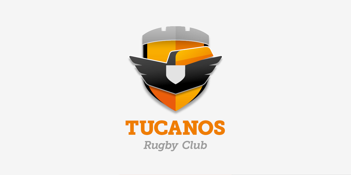
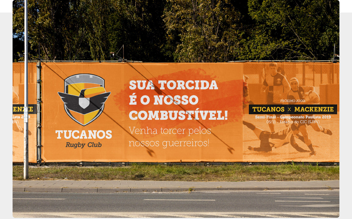
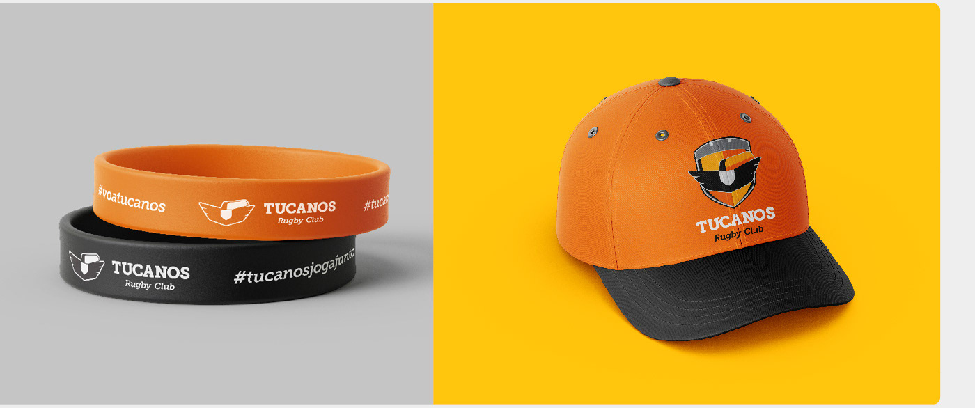
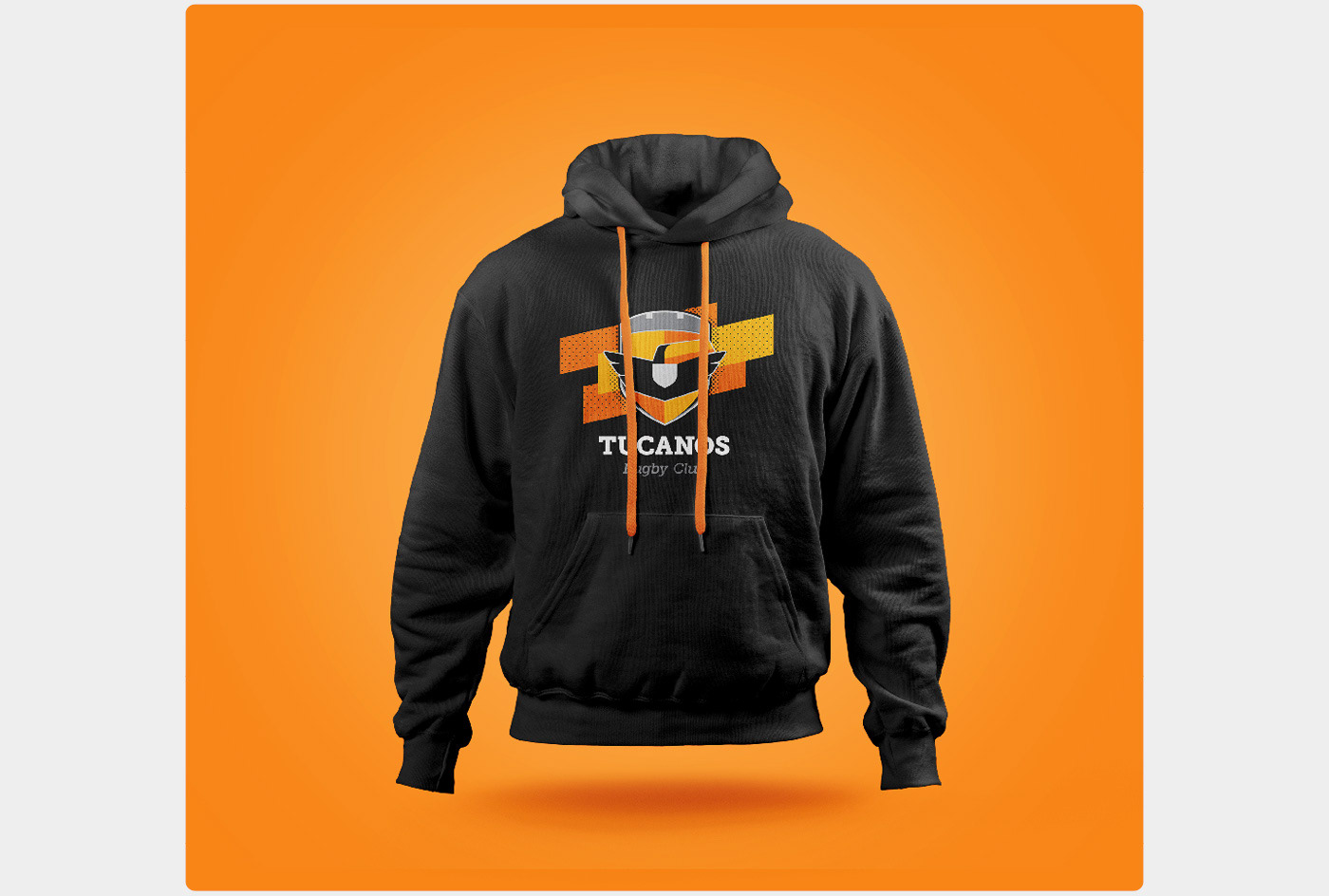
No desenho do símbolo, resgatamos a imagem de um tucano, porém estilizada, com asas abertas e linhas anguladas, conciliando a ideia de coragem e dinamismo no ataque, com a beleza e maestria dos movimentos. Junto ao tucano, unimos elementos inspirados nos brasões das cidades de São João da Boa Vista e Águas da Prata: o escudo, símbolo de honra e defesa, ligado à tradição da heráldica e aos brasões medievais da Inglaterra, berço do rugby; e as muralhas com torres, símbolos que carregam a história de luta e resistência dessas cidades que foram importantes fronts de batalha da Revolução Constitucionalista de 1932.
O resultado alcançado foi uma marca que representa o Tucanos Rugby Club como ele realmente é: uma equipe que carrega consigo a história de suas cidades, defendendo com bravura e honra cada centímetro do campo como se estivesse em um front de batalha; e, assim como um tucano a voar, avança com coragem, dinamismo e beleza, buscando a vitória o tempo todo.
// EN
In the process of creating and discovering this new brand, our first step was to define a brand archetype that would translate and guide the desired personality, as well as the verbal and visual expressions. Taking into account the team's history of struggle and overcoming challenges, we opted for the Hero archetype, always seeking victory through effort, dedication, and courage in the face of the greatest obstacles.
In the design of the symbol, we brought back the image of a toucan, but stylized, with spread wings and angular lines, combining the ideas of courage and dynamism in the attack, along with the beauty and mastery of movements. Alongside the toucan, we incorporated elements inspired by the coats of arms of São João da Boa Vista and Águas da Prata: the shield, a symbol of honor and defense, linked to the tradition of heraldry and medieval coats of arms from England, the birthplace of rugby; and the fortified walls with towers, symbols that carry the history of struggle and resistance from these cities, which were important battlefronts during the Constitutional Revolution of 1932.
The result achieved was a brand that represents Tucanos Rugby Club as it really is: a team that carries the history of its cities,defending with bravery and honor every centimeter of the field as if it were on a battlefront; and, just like a toucan in flight, it advances with courage, dynamism and beauty, always seeking victory.


Acompanhe o Tucanos Rugby Club: @tucanosrugbclub
Colaborou neste projeto: Cristiano Censoni
Fotografias de São João da Boa Vista e Águas da Prata: Celso Molinari (@celsaovip)